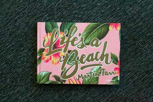
Published in 2012, the limited edition of Life’s a Beach, with photographs by Martin Parr, made several best-of-the-year lists. The limited edition (copublished by Aperture Foundation and Editions Xavier Barral) is a wonder; you can watch Parr give a delightful walk-through of it here if you haven’t had the pleasure of holding it yourself. The book offers a near perfect combination of content, design, and production that magically recreates the intimacy and tactility of a family album.
In May 2013, Aperture Foundation published its “mini edition” of Life’s a Beach. Although this edition is scaled back in both format and number of images, the Aperture team, including designers Emily Lessard and Sara Duell, has produced a version of the project that offers its own very satisfying presence. Tactility and texture are also emphasized in the mini edition, first through the cloth on the cover with the title of the book deeply embossed in gold.
Texture continues to be referenced throughout the book by pairings of textile patterns with specific images; these pairings work best when the textile pattern resonates directly with an element that appears in the corresponding photograph.
Another worthwhile difference between the editions is the way the images are sequenced. In the limited edition, the sequence occurs mostly by location, as you would expect from a facsimile family album, in which pictures would be pasted in as they were made after a trip. In the mini edition, the images appear to be sequenced according to visual cues.
If you can swing it, it’s definitely worth your while to have both iterations of Life’s a Beach on your shelf. The limited edition offers a complex experience; the sheer number of textures put under your fingers—from the cloth cover, to the Japanese binding, to the patterned pages, to the removable images—may produce sensory overload in some viewers. At times, the book design and production seem capable of stealing attention from the images. Although the mini edition is more formulaic in the presentation of the photographs, it offers an experience that focuses almost exclusively on the images themselves.
As for the photographs, they are a gleeful expression of Parr’s lifelong fascination for the beach and its peoples, all presented with the wit and saturated colors we’ve come to expect and enjoy from the artist. Like Eric Blore in a 1930’s comedy, Parr delivers both a wry smile and a bit of cutting dialog to move the plot along. —Mary Goodwin


