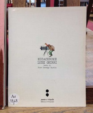
Up until November 2012, when MACK released a new edition in facsimile, Kodachrome by Luigi Ghirri (Contrejour, Paris, 1978) had been out of print for decades. The book was little seen and perhaps not as discussed as is its due, at least in America.
Parr and Badger cite Ghirri as a major influence on the rise of color photography in postwar European photography, likening the impact of Kodachrome in Europe to William Eggelston’s Guide in America (Volume I, p. 231). I agree with Parr and Badger’s description that Kodachrome is, “A modest paperback containing modest photographs that are more complicated than they seem at first glance.” The look and feel of the book certainly creates a simple first impression starting with the cartoon and notebook-like grid pattern on the cover. The soft cover and relatively thin feel to the book are also reminiscent of a workbook.
Set apart by use of an uncoated paper, the first signature of Kodachrome contains a preface by Piero Berengo Gardin and an artist statement by Ghirri. Gardin’s text will have to be enjoyed in the Italian as the English translation surely doesn’t do its ideas justice. (The translation does get points for use of the words antonomasia, of which Kodachrome is one, and algid, a great word in the context of photography.) Both Gardin’s preface and Ghirri’s artist statement are heavy on theory, and both pieces make much of the importance of the white space surrounding photographic images – “It is because of this cancellation that the picture assumes meaning and gets measurable,” writes Ghirri. Foreshadowing the formalism of the images to follow, the artist states that he is not interested in decisive moments but instead prefers his “hieroglyphs.”
Ghirri provides a structure more rigid than the Rosetta Stone for his hieroglyphs. With rare exception, the spreads contain two images, always verticals paired with verticals and horizontals with horizontals. The images are paired using visual elements as a uniting factor, rather than by any apparent meaning that those elements may have. People figure in only as part of the landscape, and they become formal elements too.
We are given the location and date of the images, many of which were taken on a trip to Ile Rousee in 1976, and beach and sky figure into several of the compositions. These large areas of sky often contain something we don’t really see too much of anymore: artifacts of the film process including nicks in the emulsion, lint, and scratches (take a look at pages 28 and 29, for example). Curiously, these “mistakes” in the reproductions add a layer of nostalgia to the work. In the 2012 edition of Kodachrome, which utilizes new image files from modern scans of Ghirri’s original film, these scratches and lint marks are removed from the reproductions.
With the issue of the second edition, more attention is being given to Kodachrome, with some reviewers scratching their heads a bit. If there is any lingering mystery about why this book is given so much weight, thinking about it as a book rather than as a series of photographs may shed some light. The delight of Kodachrome is in how the images perform in the book format, specifically in how the photographs work together on spreads. In the most successful pairings, the images synergistically magnify the questions of representation that inform the work as a whole. In this way, Kodachrome gives us a prime example of why it’s important to view a book first person, in your own hands.
I looked at a first edition of Kodachrome at the National Library of France Richelieu, Paris. Click here to find a copy of Kodachrome at a library near you. —Mary Goodwin


